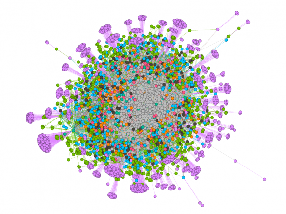
First look at network visualisation

In scoping technical aspects of the project, I knew it would be a good idea to ‘look’ at data. It would trigger good thought processes as well as get me started on the track of understanding how to make solid visualisations of networks and communities, to show relationships and illustrate points made in relevant discussion.
I already know about the principle of data visualisation through Raphaël.js and D3.jsJavaScript libraries. But obtaining and then hooking up datasets is a whole other ballpark. So, after more pondering and an initial (tiny) foray into ‘R’ I realised that would all be a massive learning curve which I might undertake later but not now. Then I happened on Gephi. After that, this discovery into data visualisation has been simpler.
So, take a couple of use cases for getting the whole process going:
- Pull data from a Facebook page or group and visualise it somehow
- Pull data from Twitter for hashtags and visualise it somehow
I say visualise it somehow because at first it’s pretty weird knowing what you are visualising (or want to visualise), apart from the node/edge relationship, which is fairly obvious. No? Read on.
Tools and stuff you need or want to try out
- Facebook account
- Twitter Account
- Twitter API credentials
- Netvizz Facebook app
- Gephi software
- Tweecoll script for api connection to Twitter
- TwitterStreamImporter Gephi Plugin
Concept & knowledge pre-requisites
- Some command line (bash) ability
- Using API keys
- Admin rights on your pc/mac
- Twitter hashtags concept
- Node/edge concept
- What sentiment is
- Comment, like, share differences
- What an algorithm is (but not how to make one!)
Tutorials to get everything working
- Pulling FB data into Gephi via Netvizz
- Pulling Twitter data into Gephi via Tweecoll
- Tweecoll command line tutorial (youtube)
- Gephi and LinkedIn
- Gephi visualisation tutorial (youtube)
- More on visualising data with Gephi
This is a VERY short list of possible places to start with data visualisation. There are hundreds thousands of tutorials, a lot of which will be useful. As with all tutes, different ones suit different people and needs. But hopefully this list introduces the concepts you need to search for.
It’s worth saying here that you do not need to be a math wizard – I suck at maths. It’s about seeing logical ways that making a pretty picture of some kind of network relationship will be useful for whatever it is you’re doing.
Online ways of doing this
There are many free web based tools for visualising data, and even if they don’t offer some of the functionality – though some are extremely sophisticated – they will help get you started.
- Tweet App, NCSU – VERY clever tweet visualiser for many aspects of tweet content and network relationships
- Netlytic – a tool I used a while back and recall it being exceptionally powerful, but needed time to learn how to use properly
- A list of great jQuery/JavaScript stuff – for web dev skilled folks
- SchoolofData Recommends – a good practical short list. This site is useful for other aspects of data analysis too
- Data and social network/content analysis tools (Evernote note) – rough notes I’ve made on other apps and datasets. Very useful!
Software may only be Windows sometimes, don’t be put off. If you’re this far into computing, chances are you are platform agnostic. if you aren’t, you should be.
Gephi is not the only Open Source software that can do this but it is widely used. I’m also going to investigate VosViewer and Pajek.